Dos And Don’ts For On-Boarding Walkthroughs On Mobile
Twitter Reddit LinkedIn Facebook
I wrote a very short introduction to the topic a little while ago. This time around we are going into further detail.
On-boarding is the very middle part of a “triptych” like user journey, centered within user acquisition and user optimization. Since it sits in the very middle it is a pivotal part that acts as a guide pole for customer optimization and lays the groundwork for business growth. Each of these 3 steps of the user journey do not exist in a vacuum of their own but rather build on the groundwork or achievements of the previous one.
Ideal on-boarding does not even exist. This would be where user acquisition strategies hit the nail on its head and fully match a user’s needs (otherwise circumscribed as “Product-Market-Fit”) and is then followed by a user interface that presents an extreme focus on a single use-case and is very easy to understand. Users’ high engagement levels would hence not require you to frequently ping and remind them. The only category that fits one part of this ideal is Dating which naturally does not need any explanation, and well, competition is non-existent. Frankly, this is very unlikely.
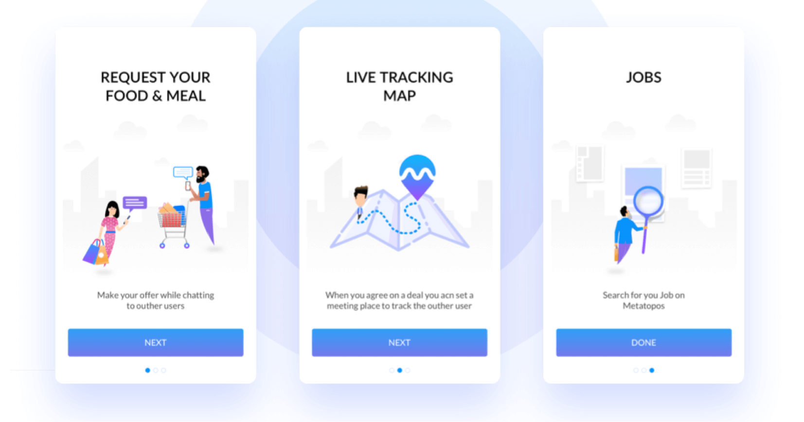
The most obvious part of on-boarding: Walkthrough’s What most people consider the very start of a mobile on-boarding schemes are those popular walkthrough’s right after the registration process. In fact, many companies use that “space” not just to explain the service by providing a useful first introduction that focuses on the core functionality the app provides but to a big extent to show off. The obvious issue here is a faulty mixture of focus. This is the wrong moment to do brand advertising. You are having a user who just found your app, downloaded and installed it.
You get barely another chance where a new user is as focused.
What she cares about the most is what the app is really about and how to get started. You shall consider this moment of attention given to you and your product as very crucial in your users’ journey, so establish the link between the message conveyed throughout your user acquisition endeavors and the walkthrough, grab and further increase the users’ interest and curiosity and then finally help them do their first action. I just don’t see how to accomplish this in a simple and hands-on way with 3-4 screens while advertising your cool company or product. You get barely another chance where a new user is as focused.
There are various parts which in its entirety complement proper walkthrough’s. So let us take each of them in turn and go into further detail of how they interact with each other and what to consider.
Whether 1 or 10 distinct screens as your walkthrough (Mailbox for iOS has actually 23) work best for your company is totally up to you to test out, however, those screens need to be focused, simple and concise, have an action button at the end, are designed ideally in an interactive fashion and its’ single parts can be tracked. And finally, soft-code the content.
Simple and concise
After converting a user you barely get another or better chance to explain the core functionality of your product. Trying to explain too much on too many small screens rarely works, especially if you want to have a user do her first action right after.
Perform an action at the end
The buttons’ actions is a bit of an ideal because it may need a controlled environment. What do I mean? Imagine an app with the main utility of share photos at an event. There will surely be a lot of people that download the app before or during the event but the majority of new downloads will happening during non-event times. Hence, an action button placed at the end of a walkthrough that shall be used to create a new event will have very limited use for the majority of new users. So, changing the buttons’ action on the server-side can give you a lot of flexibility and room to experiment.
Interactive
Plain text is the worst method to convey and learn, doing stuff oneself counts big time. Mailbox’s 23 single screens (which at times do not change much) is the prime example. Whenever possible create interactive screens that require the user to perform an action in order to demonstrate the main feature.
Tracking behavior
This should really need no explanation. Tracking is key, especially at a point where you can now combine and control web-based marketing campaigns with those in-app.
Soft-coding content
Plainly speaking, why shall marketing experiments be the normal on the web but not on mobile? Achieving consistency on what you are communicating throughout user acquisition and walkthrough’s (or on-boarding in a broader sense) in predictable ways is very hard because of the pure nature of very flexible and easy to set up web-based marketing experiments on one side (e.g. landing pages) but less flexible software systems on the other. Things get very complex on more rigid mobile platforms like iOS where things, bottom line, are determined by restrictions of Apple’s app approval process.
A clever way to better align and holistically test user acquisition before, and on-boarding after app installation is to build optimized mobile landing pages that appear within your mobile walkthrough. Thanks to responsive design techniques and web technologies whatever you communicate on the web will then show up on mobile. You can therefore either use the very same content or align marketing communication with explanations of core functionality throughout the walkthrough in smarter ways.
As you are guessing correctly the real beauty of soft-coding content and tracking user behavior is not just an alignment of marketing endeavors but rather the ability to test and iterate on value propositions without the launch restrictions of mobile platforms. Soft-coded content will help you get many things right, however, paired with simplicity and interactive elements you will be able to reap the biggest reward.
We will cover all other aspects of on-boarding mechanisms, like email and notifications, in a future post.
(Image from Elint)
Thanks for reading.